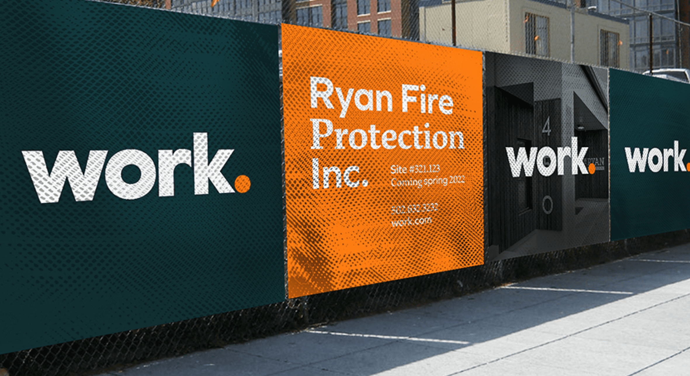
Work Architecture + Design
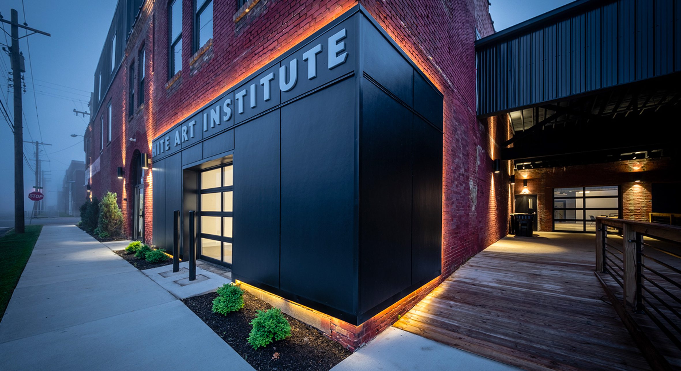
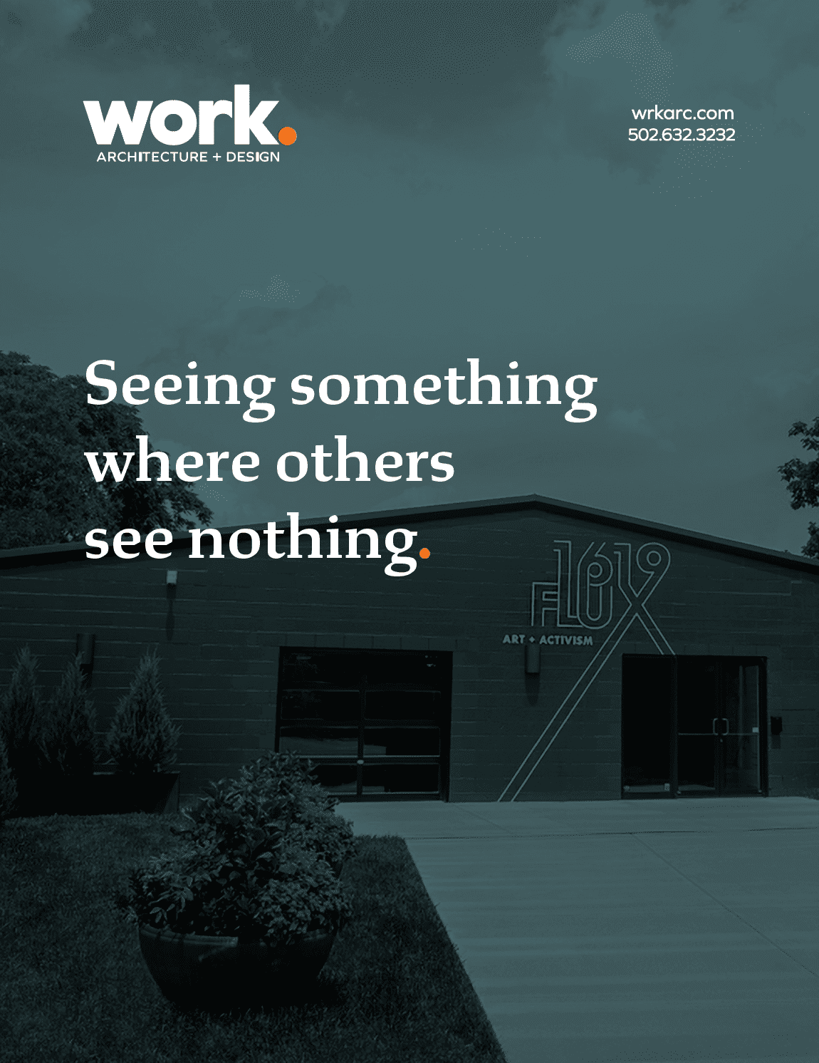
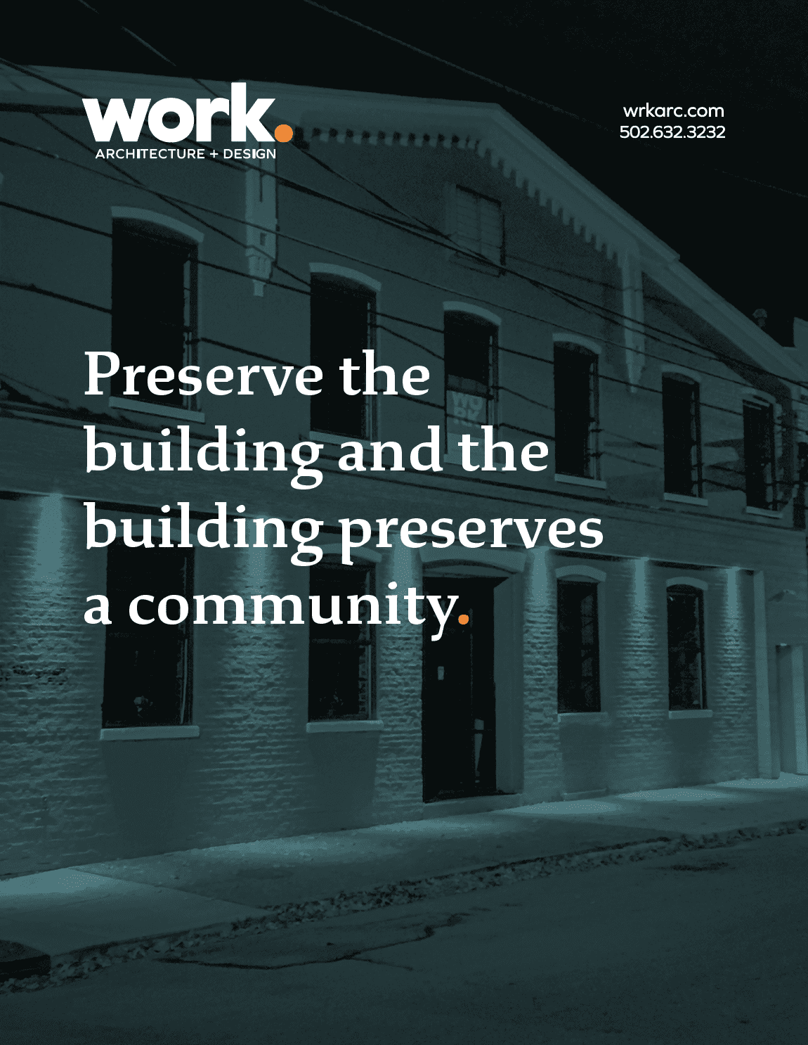
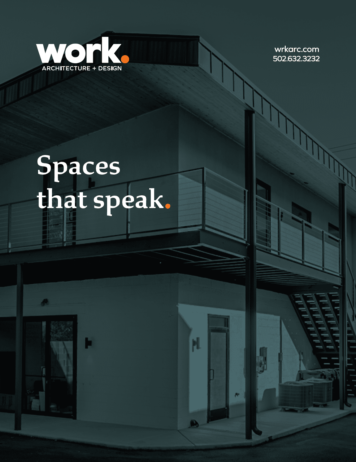
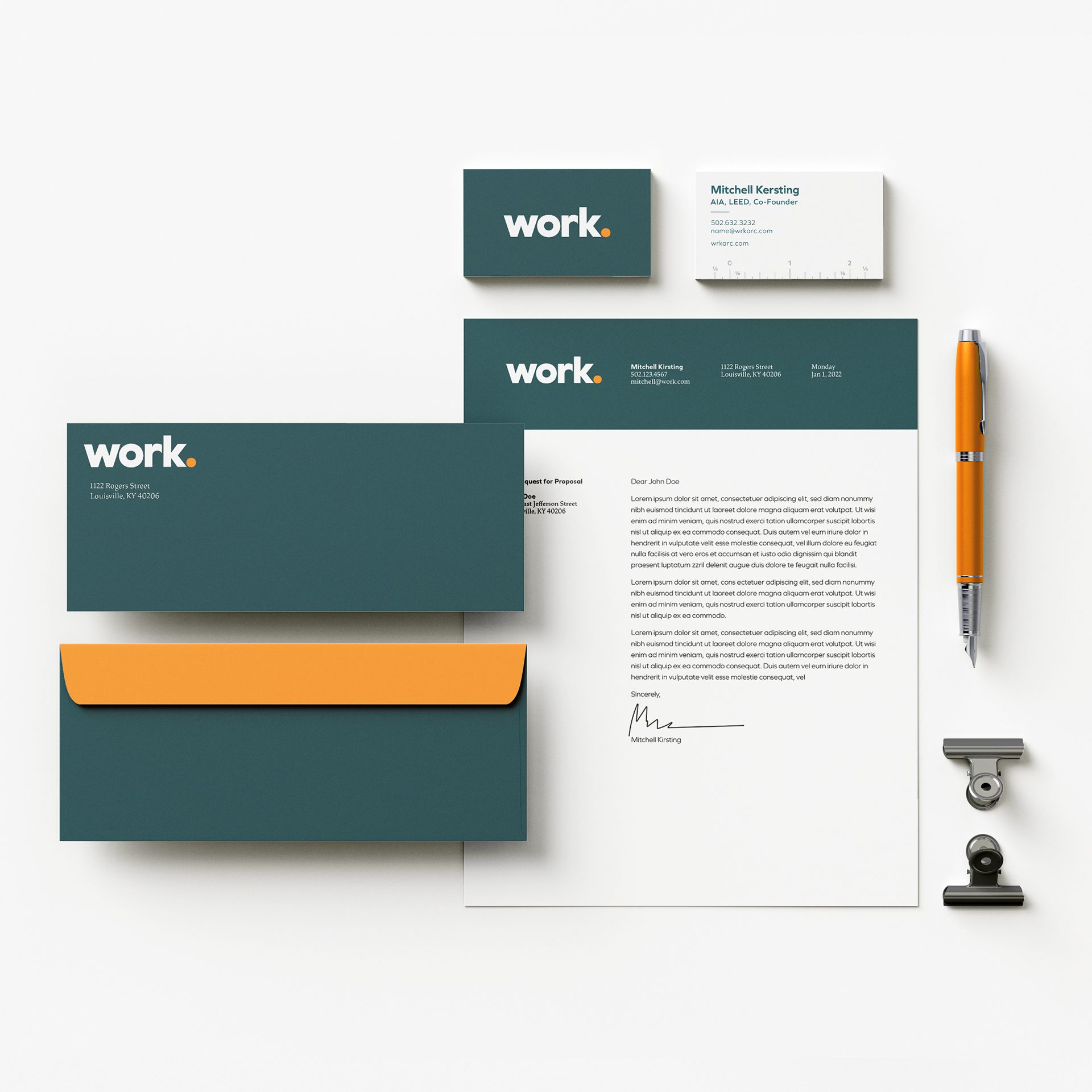
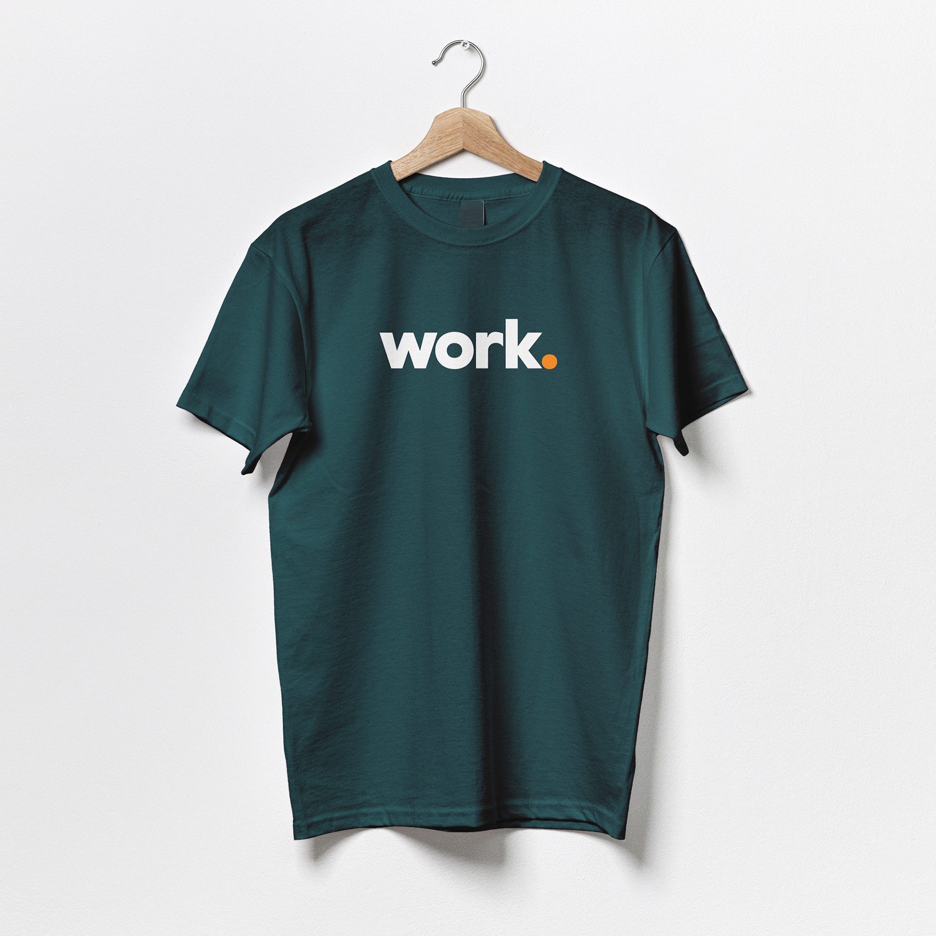
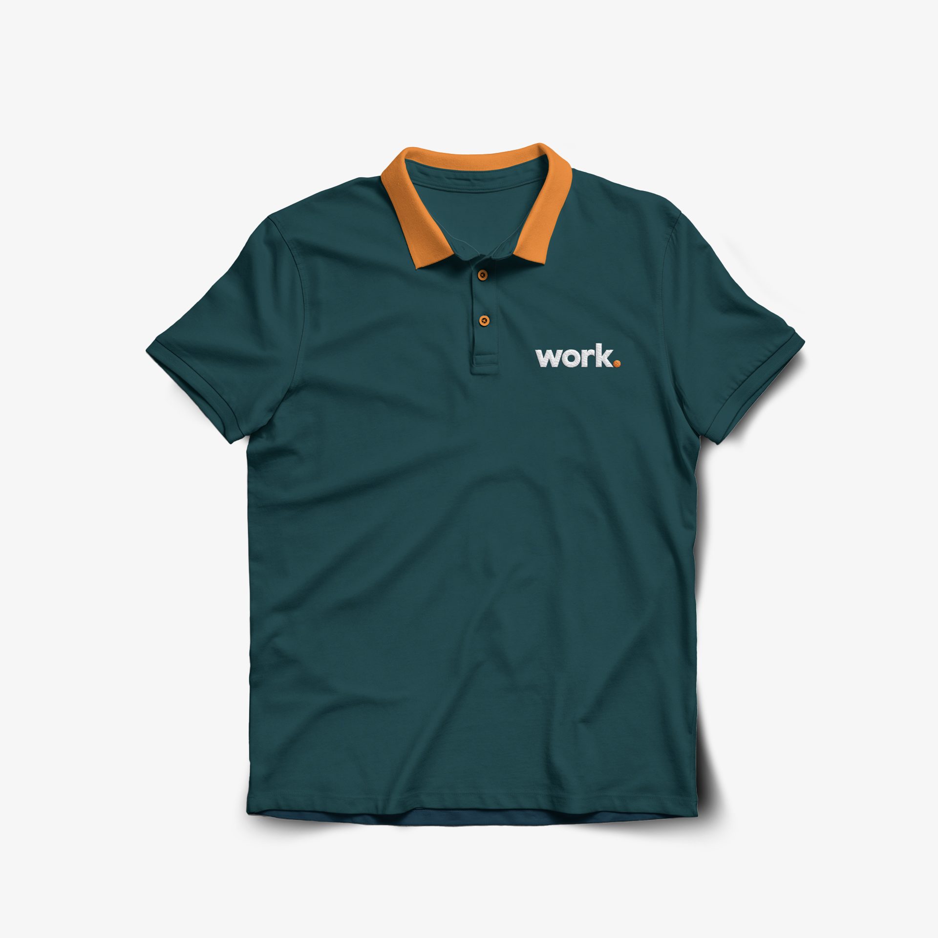
Despite being one of the better-known architecture firms in the region, recognised as much for its fun bright orange logo as its insightful, creative design, we helped Work update its identity to match its evolution into a larger and more sophisticated company. The assignment grew from an acknowledgement that Work‘s strength lay in its ability to uncover and communicate the exceptional.
Services Provided
Collateral
Copywriting
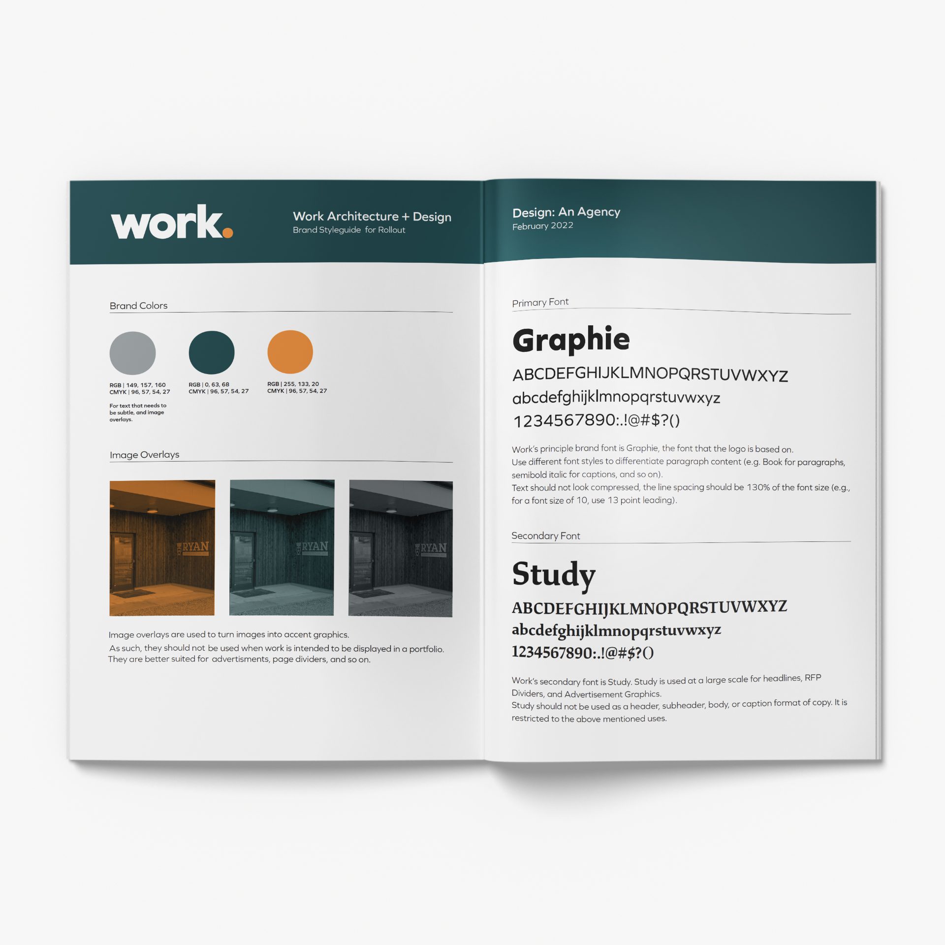
Identity Design
Graphic Branding
Publishing Design
![]()